The Gatum mark.
A confident neo-grotesque wordmark with a single electric-blue period — our signal that a message just arrived. Use it boldly. Don't over-decorate it.
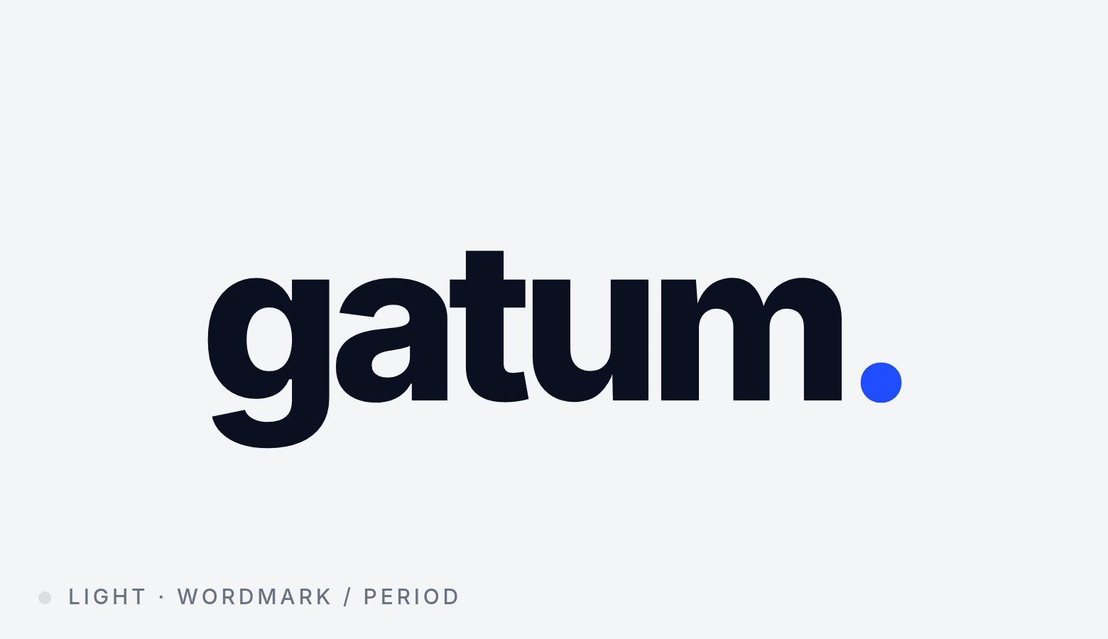
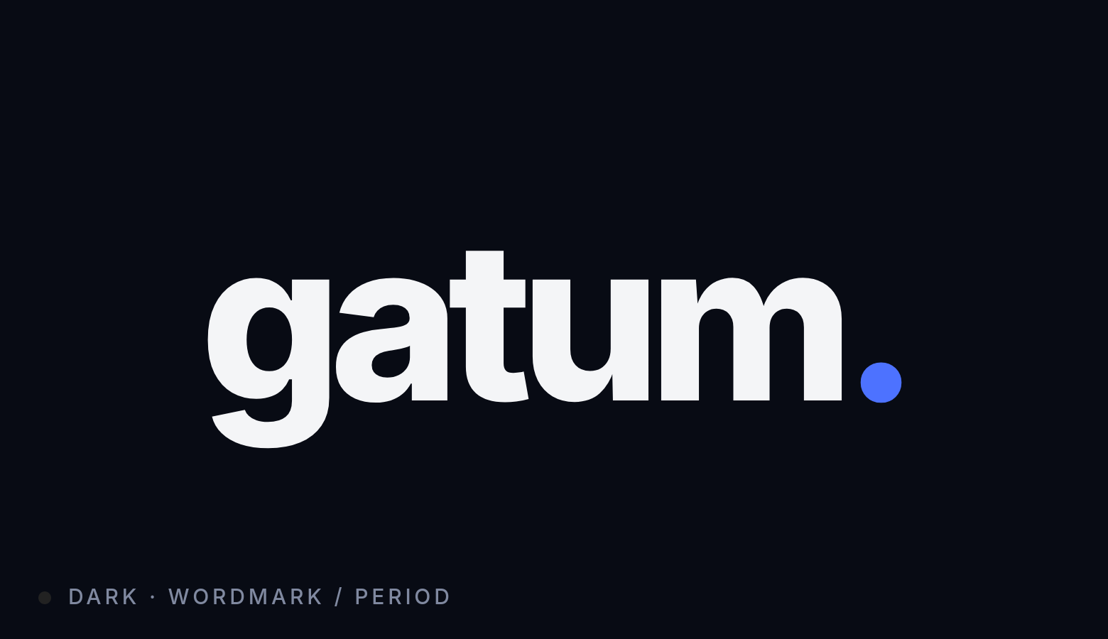
Light & dark
Two canonical lockups — one for light surfaces, one for dark. The blue period stays constant across both. Always use the artwork files; never re-type the wordmark.
Give it room to breathe
Reserve a minimum padding of 1x on all sides — where x equals the diameter of the blue period. Nothing else lives inside this frame.
Minimum sizes
The wordmark must always be legible at small sizes. Below 80 px wide (digital) or 20 mm (print), use the favicon mark instead.
Brand palette
A high-contrast monochrome system with one signal-blue accent. The accent is reserved — use it for the period, for primary actions, and for moments of emphasis.
Accent · Primary
- HEX
- #1F4DFF
- RGB
- 31, 77, 255
- HSL
- 230° 100% 56%
Foreground · Light mode
- HEX
- #0B1020
- RGB
- 11, 16, 32
- HSL
- 226° 49% 8%
Background · Light mode
- HEX
- #F4F5F7
- RGB
- 244, 245, 247
- HSL
- 220° 13% 96%
Background · Dark mode
- HEX
- #080B14
- RGB
- 8, 11, 20
- HSL
- 225° 43% 5%
Type system
The wordmark is set in Helvetica Neue ExtraBold with -5.5% tracking. For product UI and marketing we use Inter — a freely licensed neo-grotesque with identical proportions and a strong digital track record.
Do
Don't
Construction
Technical reference for digital reproduction. Use these values exactly when recreating the mark in code.
| Wordmark | gatum |
|---|---|
| Font family | "Helvetica Neue", Inter, sans-serif |
| Font weight | 800 (ExtraBold) |
| Case | lowercase |
| Letter-spacing | -0.055em (-5.5%) |
| Period color | #1F4DFF |
| Period diameter | ~0.34 × cap-height |
| Period offset | ~0.10 × cap-height from baseline |
| Foreground (light) | #0B1020 |
| Foreground (dark) | #F4F5F7 |
Downloads
All artwork is provided under the Gatum brand license — for use by Gatum employees, partners, and approved third parties only.
Need a different format or have a partnership inquiry? Email brand@gatum.io.